Start with one job for the film
A short animated promotional video still needs a precise purpose. Is it announcing an event, explaining a product or asking viewers to register? The Zero Exchange film is built around a Hackathon Competition, so the campaign idea needs to become clear before the edit spends time on atmosphere.
That focus is useful in any promotional video production: write the one sentence a viewer must remember, then let the visuals support it.
Give the sequence a three-part spine
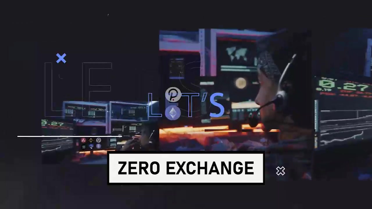
The finished Zero Exchange edit demonstrates a simple progression: interface imagery establishes the technology setting, large typography names the hackathon and the logo closes the piece. Context, message, brand.
That order makes fast motion easier to follow. Transitions can be energetic because the information itself is organised. Without a hierarchy, extra effects usually make a short film harder to understand rather than more exciting.
Use interface imagery as context, not decoration
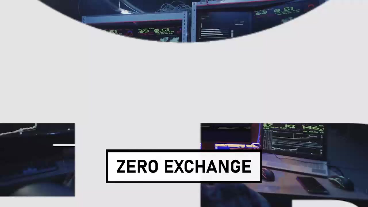
Product screens can quickly tell viewers what kind of world they are entering. They work best when the crop, scale and duration allow the audience to recognise their role without expecting them to read every detail.
In the Zero Exchange promo, layered interface views create a technology backdrop. The larger campaign typography remains responsible for the main message. This separation keeps the film legible on smaller screens.
Design for silent and small-screen viewing
Promotional films often appear in feeds, landing pages and portfolio grids where sound may be off. Essential information should therefore be carried by the picture and on-screen type. Text needs enough contrast, size and screen time to survive a phone display.
Brand colour can connect the sequence without forcing the logo into every shot. For Zero Exchange, the electric blue accent helps the interface, typography and closing identity feel part of one system.
Finish with a deliberate landing
A short promo should not simply stop when the effects run out. Its final frame can confirm the organisation, campaign name or next action. A clean landing also makes the edit easier to reuse as a page poster, thumbnail or looping preview.
See the finished approach in our Zero Exchange animated promotional video case study, where the full Hackathon Competition film opens in a YouTube lightbox.
Planning an announcement, launch or explainer? Explore our corporate video production services or send us your campaign brief.