What Is Colour Grading in Video Production?
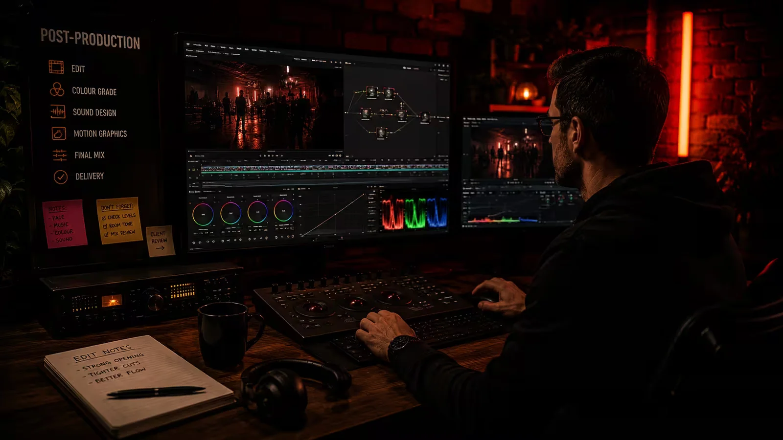
Colour grading is the process of shaping a video's finished look through adjustments to colour, contrast and brightness. It can make an image feel warmer, cooler, softer or more dramatic, while helping the film maintain a consistent visual style.
That does not mean every video needs a heavy filter. For a business interview, the right finish might be clean and natural. For a music video, it might be deliberately bold. As part of video post-production, grading should support the subject and the story, rather than become a distraction of its own.
Colour correction and colour grading: what is the difference?
The terms are often used together, but they describe slightly different jobs.
Colour correction deals with balancing the footage. That includes adjusting exposure, correcting unwanted colour casts and matching shots so they look as though they belong together.
Imagine an interview filmed with two cameras. One angle looks a little blue, while the other is warmer and slightly brighter. Cutting between them makes the difference obvious. Correction brings those images into line before a creative look is developed.
Colour grading shapes that look. Once the shots work together, the editor or colourist can refine their warmth, contrast and colour relationships to suit the film.
In practice, these stages overlap. The useful distinction is between making the footage consistent and deciding how the finished film should feel. Applying the same preset to mismatched shots does not automatically achieve either.

What does a colourist actually adjust?
Some adjustments affect the whole picture: how bright it is, how deep the shadows feel, how strong the colours are and whether the overall balance leans warm or cool. Others are much more selective.
A face might need a small correction without changing the background. A distracting colour could be toned down, or a product's packaging brought closer to its reference colour. Masks and tracking allow adjustments to follow particular areas as subjects move through the frame.
This is not simply a case of making everything brighter and more colourful. Pushing contrast too far can hide useful detail; too much saturation can make people and products look unnatural. More adjustment is not necessarily an improvement.
The shots also need to work in sequence. A frame can look lovely on its own and still feel wrong when it cuts from a much darker or cooler image. Matching is about visual continuity, not making every location look identical.
The finished look starts before filming
Grading happens in post-production, but many of the decisions that shape the image happen much earlier.
Lighting, locations, backgrounds, clothing and props all influence the available palette. Thinking about these during pre-production gives the shoot a direction instead of leaving every creative decision until the edit.
For our Partners in Crime music video with Jake Aldridge, the pink-and-blue palette was built into the set, outfits and lighting. That is an example of creating the intended colour relationships on location, rather than expecting post-production to invent them afterwards.
The technical choices matter too. Suitable exposure and white balance, considered lighting and an appropriate recording format give the colourist a better starting point. Reference charts can also help when footage comes from different cameras.
Grading can improve a lot, but it cannot restore genuine detail that the camera never recorded. A completely clipped highlight will not reveal its original texture just because someone adjusts a slider. Getting the image right during filming remains important.
Why does ungraded footage sometimes look flat?
Some cameras record using a log profile, which is designed to retain a useful range of tonal information for post-production. Without the appropriate viewing transform, this footage can look low in contrast and washed out on an ordinary screen.
That appearance is not necessarily a mistake, nor is it the intended final look. The footage needs to be interpreted correctly within the editing and colour workflow. Equally, not every camera records log, and a flat-looking image is not automatically a sign of higher quality.
This is where colour management comes in. It provides a controlled way to handle the colour information from different sources and prepare it for the intended output. Camera footage, phone clips and graphics may not all arrive in the same format, so treating everything identically can produce inconsistent results.
Is colour grading the same as applying a LUT?
No. A LUT, short for lookup table, maps one set of colour values to another. Depending on its purpose, it can help convert footage for viewing or provide a starting point for a creative look.
It does not understand the scene. It cannot decide that a face needs a separate correction, that a product has changed colour or that two adjacent shots do not match.
LUTs can be useful, but they need to suit the footage and the workflow. Some colour-managed workflows handle the conversion without an input LUT, so adding one unnecessarily can apply the transformation twice. The important thing is the result, not whether a particular preset was used.
Different films need different approaches
For corporate video production, a restrained grade is often appropriate. People should look like themselves, workplaces should remain believable and the finish should support the organisation's identity. Natural does not mean unfinished; it means the adjustments are not drawing attention away from the message.
With product videography, accurate colour can be especially important. Making a blue garment look turquoise or changing the apparent finish of a piece of furniture may create an attractive image, but it also creates the wrong expectation. A stylised background should not come at the expense of the product itself.
Music video production can allow more freedom. Strong colour contrasts, unusual tones or a deliberately muted palette might suit the track. The choice should come from the creative direction, not an assumption that every music video needs the same treatment.
Across all of these, skin tones deserve care. People have different complexions, and the aim is not to push everyone towards one standard colour. The finish should respect the person, the lighting and the agreed style.
Logos, titles and other graphics also need checking. Their colours and readability should survive the finishing process, rather than being unintentionally altered by a look applied across the whole timeline.


How do you brief the look without knowing the technical language?
You do not need to specify software settings or arrive with a colour-grading vocabulary. A few clear references and an explanation of what matters are more useful.
When writing a video production brief, include:
- The feeling you are aiming for. For example, bright and approachable, understated and natural, or bold and energetic.
- References with an explanation. Point out the soft contrast, restrained colours or treatment of faces you like, rather than simply asking for another film to be copied.
- Colours that need protecting. Supply brand guidance and relevant product references, and identify any finish or material the viewer needs to see accurately.
- Where the video will be used. A website film, a social campaign and a large-screen presentation may involve different delivery requirements.
It is useful to agree the direction on a few representative shots before refining the entire film. Detailed grading is usually most efficient once the edit is reasonably settled, because replacing shots can mean repeating matching and tracking work.
For feedback, describe what looks wrong: "The product looks too warm" is more helpful than requesting an arbitrary change to a colour slider. Where several people are reviewing, one consolidated set of comments makes the intended result easier to understand.
Why can the same video look different on different screens?
Screens and playback applications do not all display colour in exactly the same way. Brightness settings, display characteristics and viewing conditions can change the apparent contrast and colour of an image.
A calibrated reference display provides a more dependable basis for grading than an arbitrary laptop setting. It cannot make every viewer's phone or television identical, though, so a promise of perfect colour everywhere would be unrealistic.
The finished export needs checking as well as the editing timeline. Review the actual delivery file and, where practical, the version playing through its intended platform. Look for changes in dark detail, colour, smooth gradients and the readability of graphics.
For a colour-critical product, agree the references and review conditions early. Judging the same sample on several unrelated screens can otherwise lead to conflicting feedback about something the grade alone cannot control.
A good grade should feel right for the film
Colour grading is one part of a finished production, alongside the edit, graphics and professional audio. It should help those elements work together, not compete with them.
Sometimes the result is striking. Sometimes it is simply a natural-looking film in which nothing jars between shots. Both can be the right answer.
Planning a film for your business or a creative project? Tell us about the idea, the look you have in mind and where the video needs to work. We can discuss how to carry that direction through planning, filming and the final edit.