
Product Photography: What Makes a Product Look Professional?
Open your online shop and look at the products together, rather than opening each photograph separately.
Do the backgrounds match? Are similar products shown at a similar size? Can you read the packaging? Does a black finish stay black across the range, or drift from grey to blue depending on the photograph?
Small differences become much more obvious when the pictures sit beside each other.
Professional product photography is not one particular look. It can be a clean photograph on white or a colourful, carefully built scene. What matters is whether the image presents the actual product clearly, suits the brand and works where the customer will see it.
That is the starting point for our product photography: not simply making an attractive picture, but deciding what that picture needs to show.
A product page needs more than one flattering angle
Imagine buying a bag online. A beautifully lit front view might catch your attention, but you may also want to see the fastening, the lining, the pockets and how it sits on someone's shoulder. Four near-identical front views will not answer those questions.
The same principle applies to packaging, food, furniture, tools and almost anything else you sell.
Start with a clear overall view, then give the other photographs different jobs. Show the important detail. Show the reverse when it matters. Show the product in use, or alongside something that makes its scale easier to understand. Where exact dimensions matter, give the measurements in the listing rather than relying on a photograph alone.
Be equally clear about what is included. A styled photograph can contain props, but the customer should not have to guess whether the stand, accessories or second product come with their order.
This is where photography for your business website becomes useful rather than decorative: each image answers something the visitor needs to know.
Before the shoot, check the requirements of any retailer, marketplace or advertising feed you use. Your own website's campaign banner and a marketplace's main listing image may need very different treatments. Google Merchant Center's product-image guidance, for example, distinguishes the main image from additional images and sets its own presentation requirements. One attractive file is not automatically suitable everywhere.
White backgrounds and creative sets do different jobs
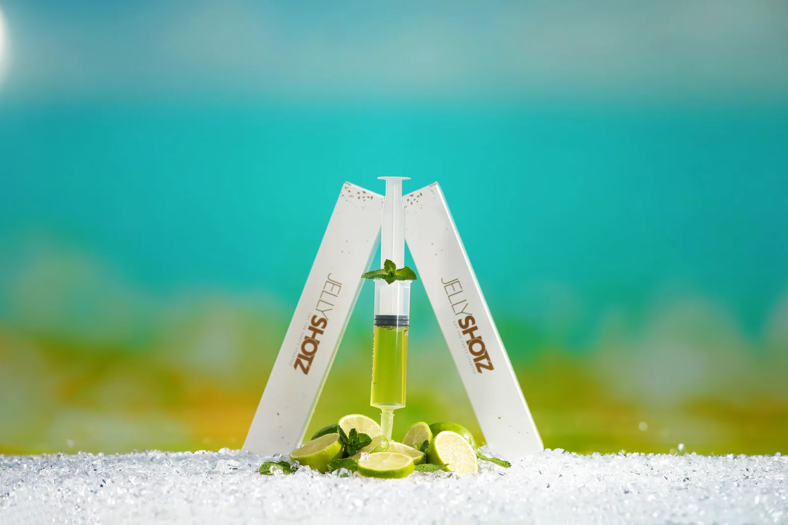
A white background is useful when you need the product to stand on its own. It can make a range easy to compare and leave a designer room to place the image into a layout.
It is not a shortcut, though. White packaging still needs visible edges. A clear bottle still needs a recognisable shape. A pale object on a pale background can disappear if the lighting and separation are wrong.
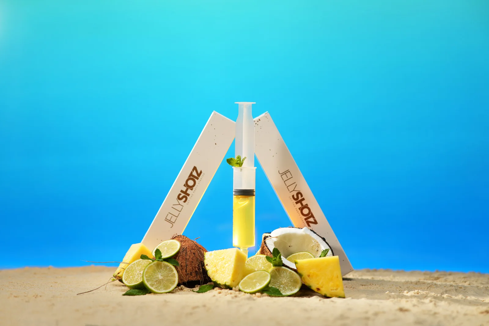
A creative scene has more room to establish character. Colour, surfaces and props can connect the product with an occasion or suggest the feeling of using it. The risk is that the set becomes more interesting than the thing being sold.
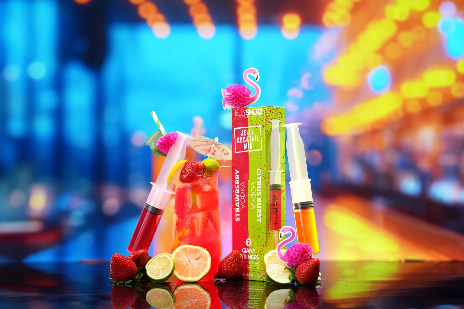
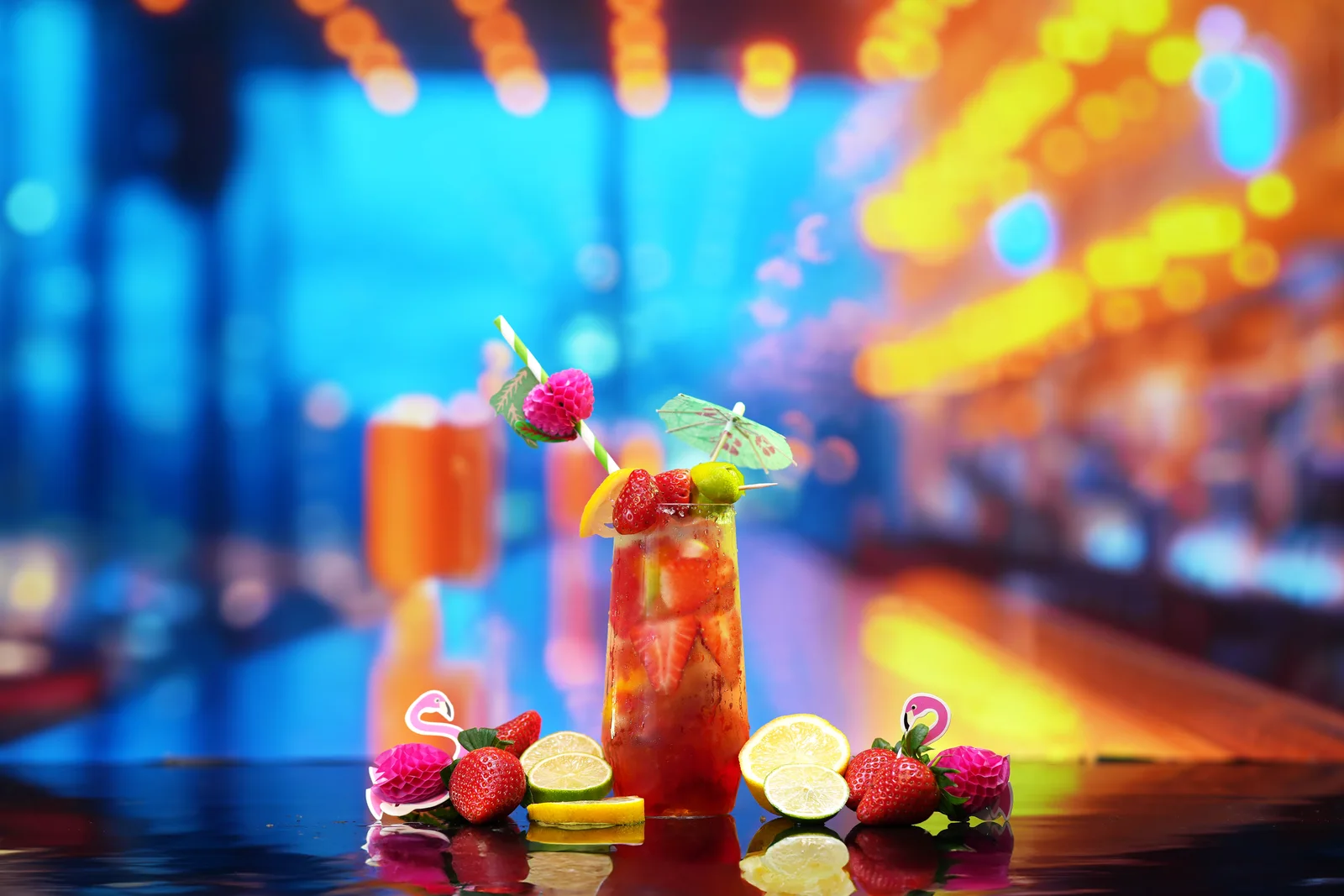
Our Jellyshotz photography and film project shows how both approaches can belong in the same production. The styled photographs took their colour and atmosphere from the packaging. Orange Splash used an orange-and-blue pool setting, while the other flavours had their own visual identities. Separate white-background and green-screen photographs provided product elements for other layouts.
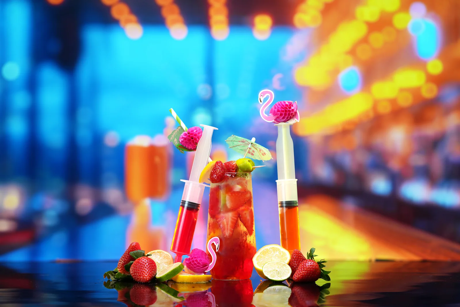
For the styled photography, we displayed digitally developed backgrounds on a 70-inch OLED television and arranged the real products and props in front of it. The backgrounds began in MidJourney and were refined in Photoshop; the foreground still had to be physically arranged, lit and photographed. The core images' reflections were added during finishing.
The behind-the-scenes account of the TV-backdrop shoot explains that distinction. These were photographs of real products in a constructed setting, not generated replacements for the products themselves.
The lesson is not that every brand needs a television backdrop. It is that the setting should follow the product and the brief. Sometimes the right answer is a plain surface. Sometimes it is something much more playful.
Lighting should tell you what the product is made of
A glossy bottle should look glossy. Brushed metal should not look like flat grey plastic. Fabric should retain its texture.
That takes more than making the photograph brighter.
With reflective products, part of the job is deciding what the surface reflects. A controlled highlight can describe a curve; a bright patch across the label can hide the very detail someone needs to read. Removing every reflection is not necessarily an improvement, because the remaining object may lose its shape and finish.
The lighting also needs to suit the part you are showing. A broad overall view and a close-up of an embossed logo may need different adjustments. The aim is not to repeat a favourite setup regardless of the subject.
Adobe's product-photography guidance discusses diffused lighting and repeatable setups. Those are useful starting points, but the photograph still needs judging on its own terms: can you see the product's outline, the important printed information and the surface detail?
A quick test image is worth reviewing before the whole range is photographed. Look for unwanted reflections, crooked labels and missing detail while there is still time to change the setup.
Focus needs the same attention. A blurred background can work well, but it is less helpful when half the product is blurred too. Decide which details need to be sharp rather than treating a shallow depth of field as a sign of quality by itself.
Make the range look like it belongs together
Consistency is easiest to notice when it is missing.
One product leans left. Another is photographed from above. Some shadows fall backwards and others sideways. The images may look acceptable individually, but together they make the shop feel pieced together.
Agree a repeatable starting point: camera height, viewing angle, background, shadow treatment and the amount of space around the product. Different shapes will need adjustments, so consistency does not mean forcing a tall bottle and a shallow box into identical framing. It means finding a balanced way to present both.
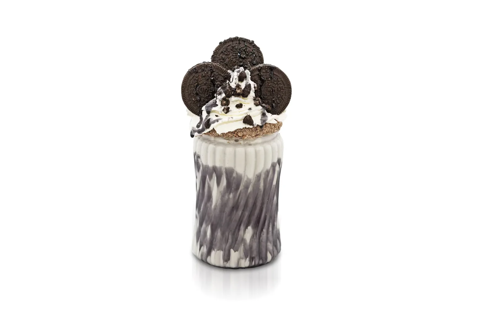
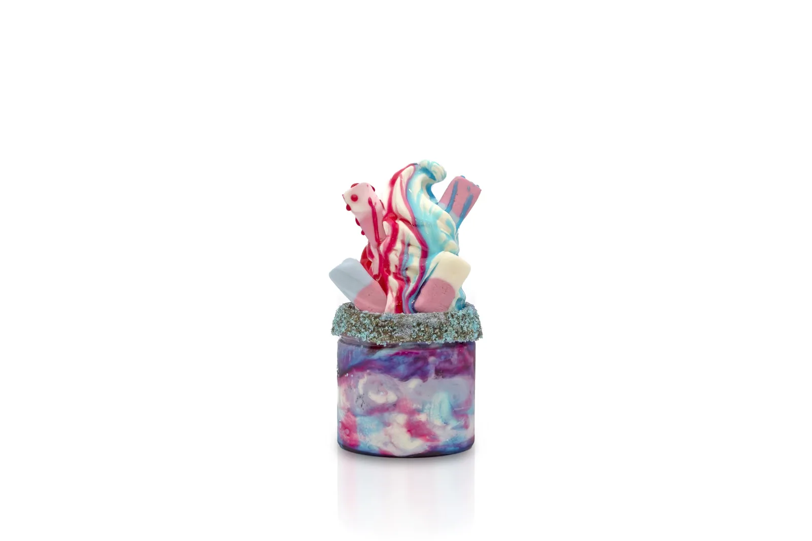
For Social Shakes, our work developed into a library of around 500 product photographs across a longer collaboration. The products were photographed on a bright white set, with front views, overheads, groups and details giving the brand options for menus and other layouts.
That was not simply one hero photograph repeated hundreds of times. It was a collection with different uses, held together by a consistent approach.
Our guide to building a product content library looks at that wider planning. Even a small range benefits from deciding how the next product will fit alongside the existing ones.
Keep a reference image and notes from the approved setup. When packaging, colours or product specifications change, identify which photographs need replacing. You do not necessarily need to refresh everything; our guide to updating business photography covers making that decision without starting again unnecessarily.
The product needs preparing before the camera does
Send the current version, not the nearest sample to hand.
Check the packaging artwork, labels, colour, size and included parts before the shoot. A beautifully photographed prototype is still the wrong image if the customer will receive something different.
Then look at the physical condition. Wipe fingerprints away, remove temporary stickers, straighten labels and check for dented corners or loose threads. Bring spare packaging or another sample where practical, particularly when opening, pouring, cutting or handling the product will change its appearance.
Food needs planning around its condition as well as its presentation. Allow for preparation and replacement rather than expecting one finished dish to stay suitable through every lighting change and camera angle.
This is also the moment to flag details the photographer might otherwise mistake for faults. A handmade surface, visible seam or natural variation might be part of the product, not something to tidy away later.
Give each item a clear name or product code and record the required views. The preparation in our brand photography shoot guide is useful here: a short, accurate brief is more valuable than a long list of vague ideas.
Retouch the photograph, not the product into something else
Removing a temporary speck of dust is different from smoothing away the texture a customer is buying.
Product retouching can include cleaning up the background, removing a temporary support, refining the crop or balancing the finished set. More involved work might combine carefully planned captures or create a particular shadow and reflection treatment.
Agree those decisions before photographing the whole range. A clean cut-out, a natural grounded shadow and a glossy reflected finish are different results, not interchangeable versions of "a bit of editing".
The boundary should be the actual product. Avoid changing its shape, adding accessories, rewriting packaging or making an ordinary finish appear to be a different material. Any substantial alteration needs checking by someone who knows what will be supplied.
Colour deserves a separate review. Use an approved product sample and a consistent colour-managed workflow where accurate colour is important. Do not solve a disagreement by making repeated adjustments to suit whichever phone happens to be used that day; screens can display the same file differently.
A warm campaign treatment may suit the brand, but it should not leave the customer choosing between colours that no longer resemble the available variants.
Retouching should leave you with a better-presented photograph of the same item.
Check the small version as well as the full-size file
The customer may first see the photograph in a small product card, not across a large editing monitor.
Reduce it to roughly the size it will appear on the website. Is the product still distinct? Does the main label remain understandable? Have the props turned into clutter? Is a tiny subject lost in a huge expanse of background?
Then check the larger view for the detail people may inspect before buying. The thumbnail and the close-up need to work together.
Ask your designer for the layouts before the shoot. A square shop image, a portrait social post and a wide banner with text beside the product may need different compositions. Cropping is useful, but it cannot create space that was never photographed or recover a part of the product that was outside the frame.
Agree the files you need at delivery: high-resolution versions, appropriately sized web exports, transparent cut-outs where required, and a naming system that identifies the product and view. Keep the approved masters separately from the smaller publishing copies.
Also confirm the intended uses and which files are included. Finished photographs, editable layered files and original camera files are not the same handover.
If the launch also needs portraits, workplace images or photographs of the product being made, plan those alongside the product set through our wider commercial photography service. They need time in the brief rather than becoming extras squeezed into the final few minutes.
Need to show movement? Plan that before the set is cleared
Sometimes the missing information is an action: how a lid opens, how a tool changes attachment or how a product is assembled.
That may be better answered by product videography than by adding another still photograph. Plan the action, framing and finished formats before the shoot, rather than assuming someone can grab a useful video once the photography is complete.
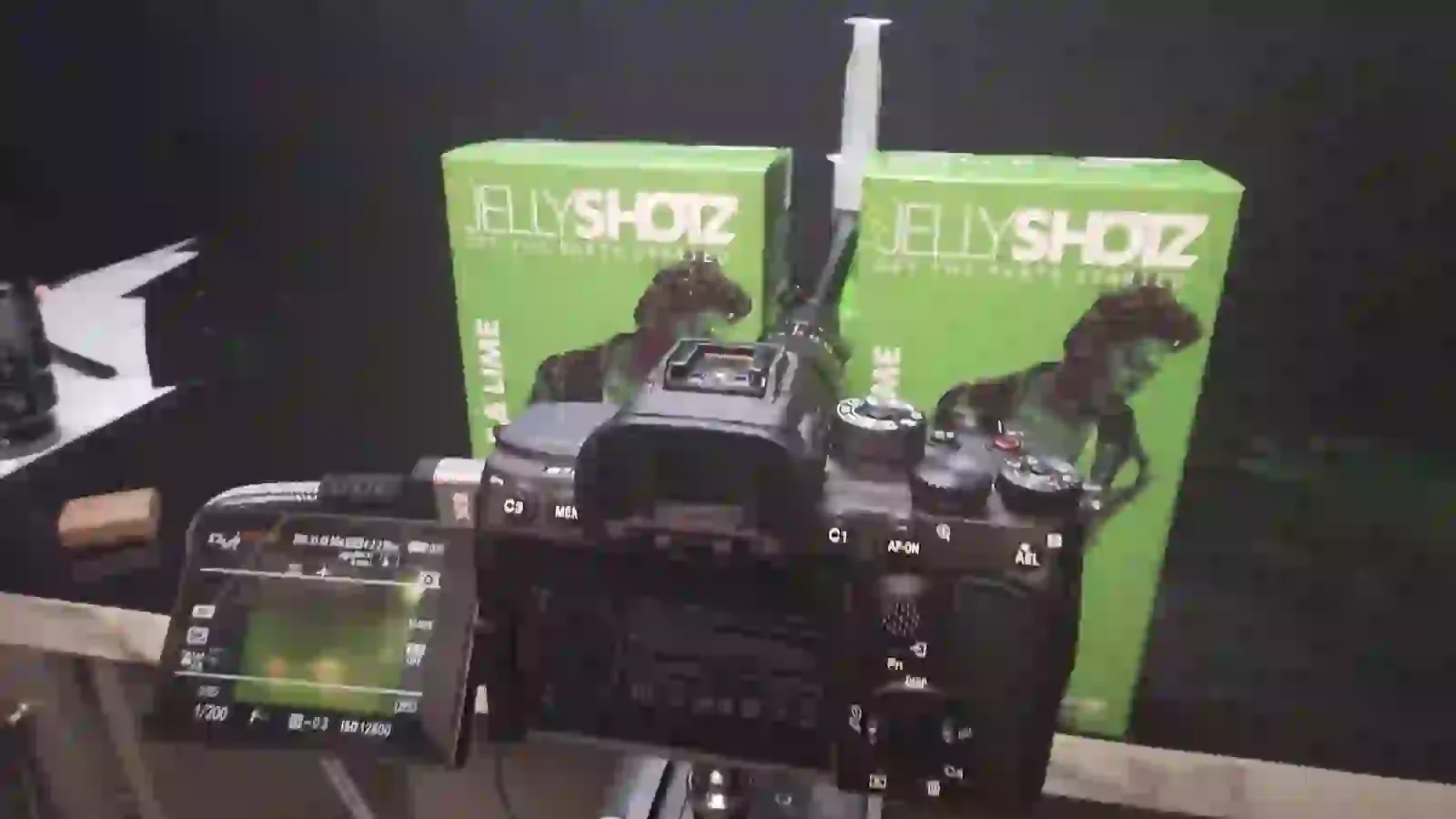
Stills and moving footage do not always use the same setup. The separate Jellyshotz kitchen video-shoot story shows a black-cloth video set, distinct from the television-backed photography described above.
The shared brief can keep the visual direction consistent, but each format still needs its own attention. Our guide to making products look better on video covers the filming decisions in more detail.
What changes the cost of a product shoot?
The number of products is only part of the answer.
Twenty boxes photographed in one repeatable setup are a different brief from twenty items that each need a separate scene, food preparation or a new lighting arrangement. The number of finished views and the amount of retouching matter too.
Our current photography and production pricing starts at £249 for the first on-location hour per operator, followed by £99 for each consecutive additional hour. Detailed retouching is £49 per hour, with the work agreed beforehand. Those are rates, not a promise that an entire product range can be photographed and finished within a particular booking.
Set preparation, props, any hired space, travel and specialist requirements need accounting for where applicable. Confirm what is included in the quotation, including the finishing required for your images. Our professional photography cost guide explains the wider budgeting questions.
An efficient shoot starts with an organised brief, not an arbitrary target for the number of products per hour.
Tell us what needs to be ready for launch
"We have twelve products" is a start. This is more useful:
We have twelve products in two pack sizes. Each needs a front view, an angled view and a close-up of the main feature. We also need three grouped photographs for the website and one wide launch image with space for a headline. The packaging is final, and the images need to be approved before the shop goes live.
That tells us what to plan, what to quote and what you expect to receive. It is an example brief, not a fixed package or a one-day promise.
Send us your product list and the places the images need to work, along with reference pictures and the deadline. We can then work out the backgrounds, preparation and finished image set around the products you actually sell.